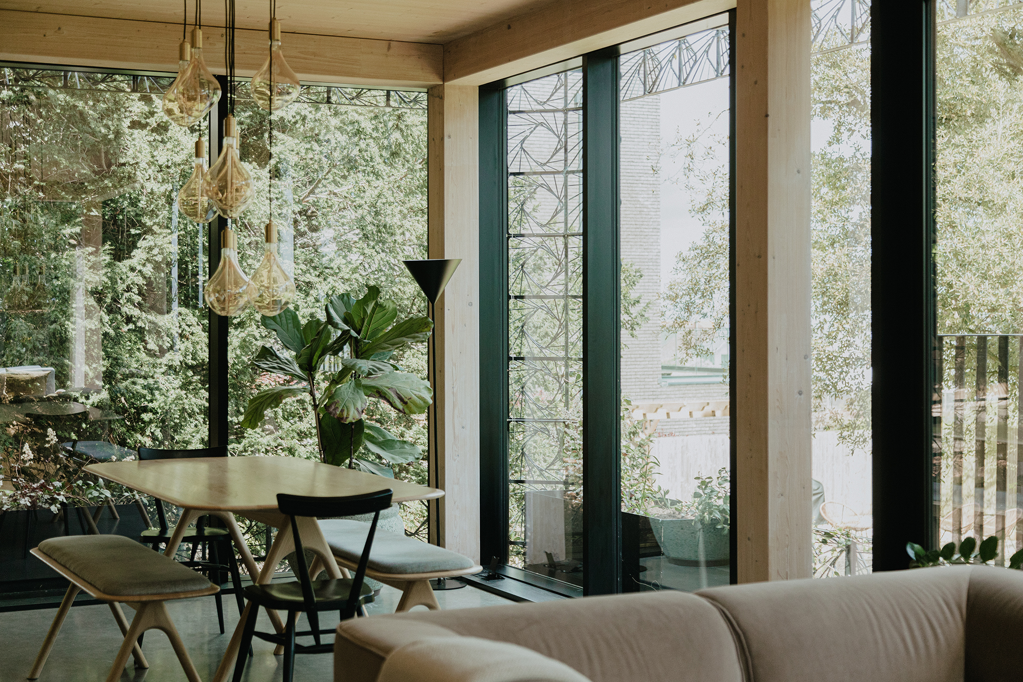
We were excited to meet with Giles and Sarah-Jane Miller of Giles Miller Studio to hear their ambitious and dynamic plans for a major project that would become the studio’s first residential property, Woven. Offering an artistic approach to architecture, the house breaks down barriers between the building's internal spaces and the glade of natural planting and trees that surround it, through a unique sculptural facade which invites nature to grow up the outside of the house whilst also being visible from within it.
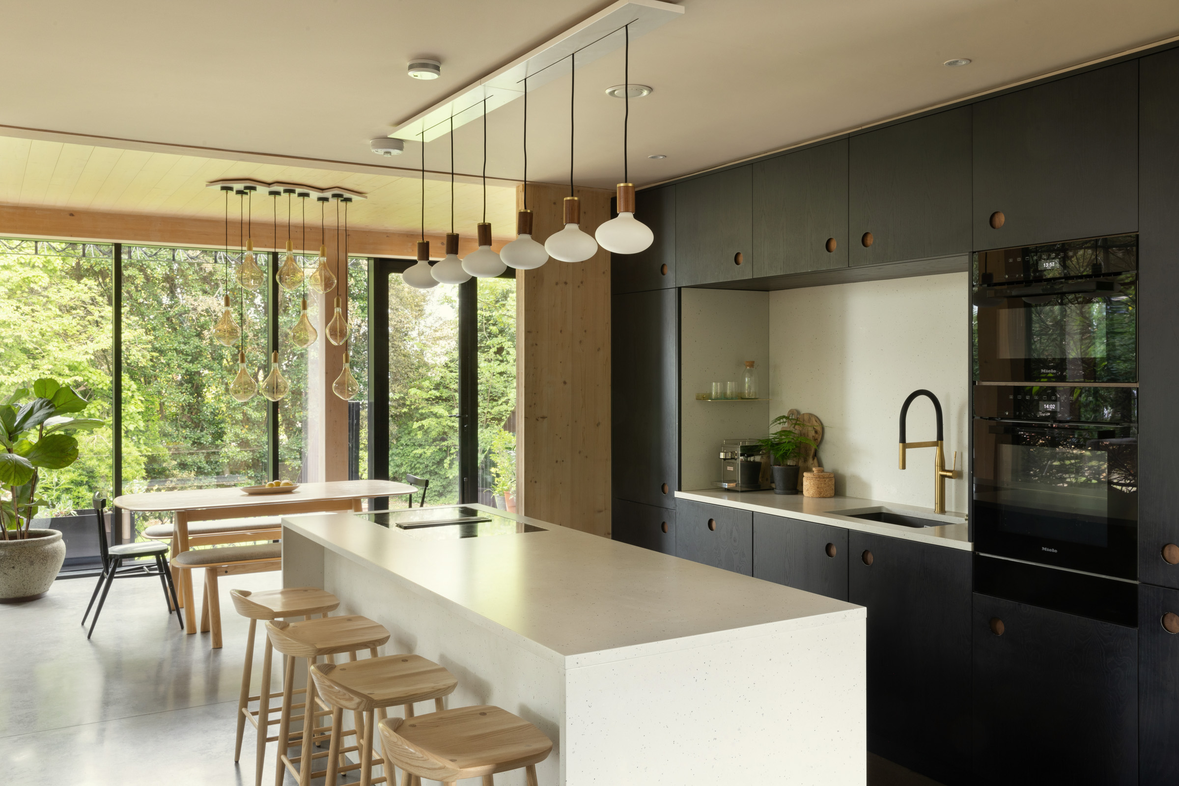
The project has been delivered by a collaborative cohort led by Giles and his studio which includes architects, artists, engineers, and makers alongside some of the world’s most conscientious suppliers. The kitchen features Miele appliances throughout along with Ercol furniture and Tala lighting.
On selecting Miele, Giles comments, “At Woven we believe that quality in the design of the products that surround us can bring comfort, happiness and health, both for us the users as well as the planet. Longer lasting and better performing products are the key to a healthier balance between humans and our environment, and so we were looking for a brand that could provide that high level of design excellence. Having visited the Miele Experience Centre, it took a matter of moments for us to know that we wanted to work with Miele. The level of design consideration impacts the quality of the products in every way. The experience of using them is seamless, and the results are as good as it gets in terms of an appliance and its function. Before coming to the Miele Experience Centre we had never before seen such a brilliant display of knowledge, depth of research, empathy for the customer and sheer design brilliance.”
Read on to discover what inspires London-based artist and designer, Giles Miller along with projects past, present and future.
What, who and where inspires you?
Perhaps it goes without saying that inspiration comes from so many different places. It's beautiful spaces, amazing people, fantastic design, sentimental objects and of course from nature. I find inspiration in space most of all, physical space and mental space. It's often in the midst of a family holiday or a weekend away with friends that an idea or a solution can come to mind, unexpectedly, and that's the beauty of the creative process.
Which design professionals do you admire?
Harry Bertoia for a style and an approach to materiality that is the closest I've found to my own, Piet Oudolf for seeing the beauty in nature in any state, Thomas Heatherwick for showing that designers can address projects of any scale, and Arnaldo Pomodoro for sheer creative force of brilliance.
How would you describe your style?
I think what defines my work now is a propensity to follow an unexpected path, without aspiration, to bring new ideas into fruition. My studio's work is one expanding evolution of an idea, and so it is experimental and unusual within the contemporary design landscape. I don't take much from the outside design world in terms of style, approach or materiality, and so my work has a unique aesthetic which brings softness and depth to spaces. More literally, my work is about the composition of materials, and it has a complex and very tactile aesthetic which can often contrast with the surrounding space.
What are your favourite materials to work with?
I'm very interested in the intersection of technology with the handmade, and most excited about the notion of engineering artworks. So, whilst I love working with natural materials such as timber and ceramics, I've been designing sculptural systems of late which can often mean cast metal in combination with moulded components. These technological objects are then assembled by hand in a way which brings them right back from the rigidity of manufacturing, and into the realm of fluid and soft artworks.
Your portfolio is wonderfully diverse - do you have a favourite project that you have worked on?
I've particularly loved working on projects at either extreme of scale - we built a pavilion for the BBC in 2019 which put my artistic approach at the centre of an architectural project, informing the rest of the scheme hugely which was certainly fulfilling for my team. At the other end of the scale, I'm currently prototyping a piece of wearable sculpture/jewellery which is tiny, but just as exciting for me. For our studio, the creation of something new and unique is the goal, whatever the scale.
Is there anything exciting that you are working on at the moment that you can tell us about?
We're currently working on some larger pieces of sculptural work, particularly in the USA which give me more creative freedom than I've ever had to date, considering they are commissioned by a client rather than self directed. We're also developing a large spherical sculpture due to be installed in California which is a departure in terms of the sculptural concept, and I hope will be a springboard for other artistic commissions of this scale. We hope that piece will be installed sometime in 2024.
This is your first residential property, what inspired this project?
The quest for scale is something that's always interested me, and this project came about when my wife Sarah-Jane and I started asking ourselves how our studio's unique approach to surface and sculpture might manifest itself in a residential building. As the project developed, we both realised that it was showing us the potential of our studio's artistic approach in terms of the benefit it could bring to users or inhabitants of a space. Our interest in light and materials led us to design a space which knocked down the barriers between internal and external spaces, bringing nature to the centre of the experience and allowing the building to live and breathe with the guests.
How does the exterior of Woven influence the interior design?
Woven was designed from the outside in, so the exterior has always been a huge informant to the internal spaces and design. The facade is designed to enable the walls to all be glass, letting light and nature into the building but shading it for comfort and balance. This meant we designed the layout with perimeter walkaround spaces, bringing the utilities and kitchen into the core of the building to look out from. Equally the bedrooms are laid out in the external corners of the building, giving them privacy from one another but making the outside the focus, even from upstairs.
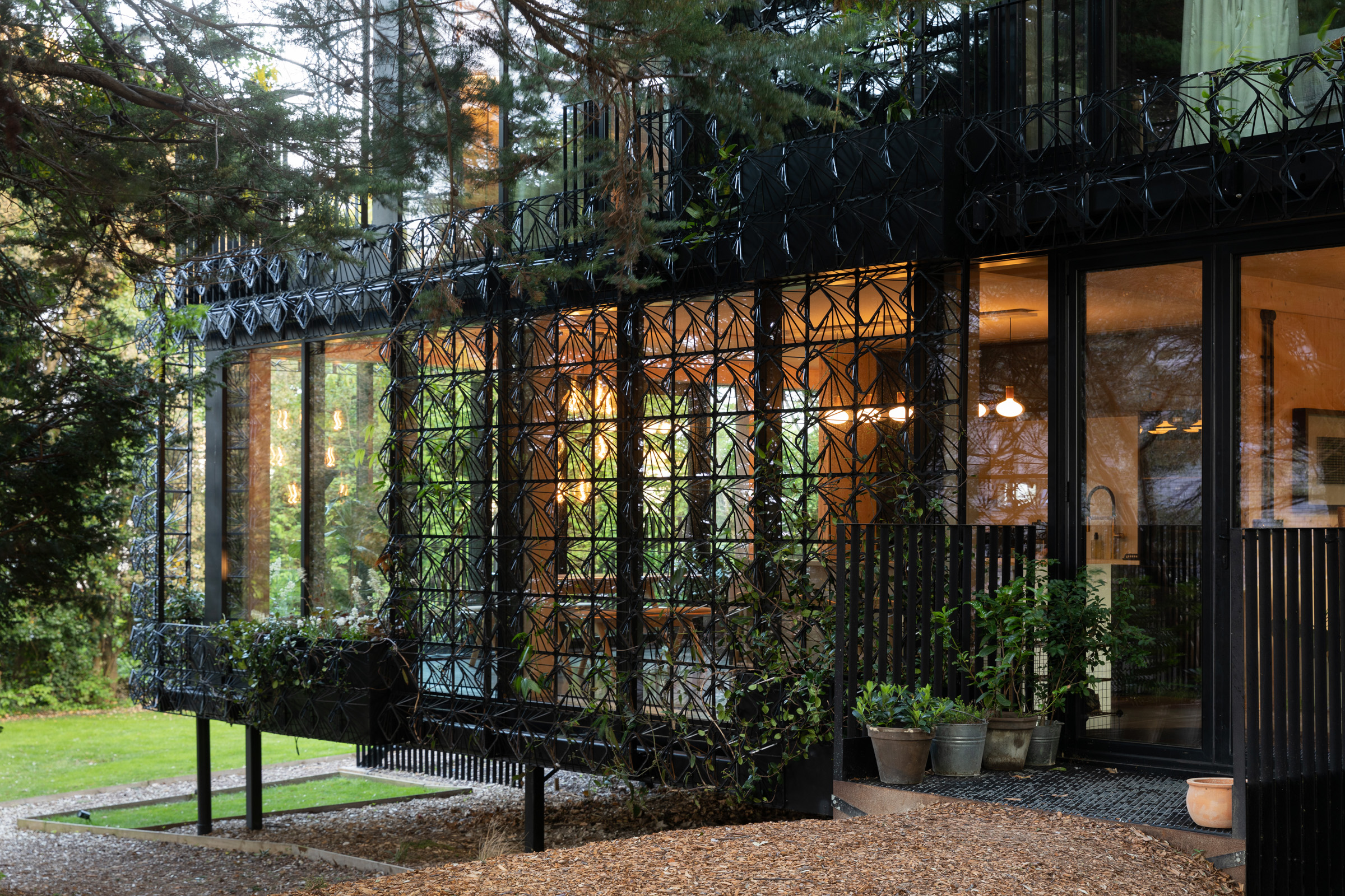
How and where was the incredible facade created?
Although the facade was central to the building's design and development, we did not install it until a year or so after the main building was complete. This gave us a chance to get to know and understand the spaces and requirements, and from there we were able to develop the facade in response to the building's internal experience. The concept of this woven lattice was originally designed for a client, but after a delay in their project they were happy to let us develop this recycled plastic version for Woven. The parts were cast from waste material in the factory in Essex and installed by our own team by hand earlier this year.
Did you have a person/ couple/ family in mind when designing Woven?
We designed it with our own family in mind. Putting ourselves at the centre of the brief allowed us to question what we would really want in a building in terms of use, effect, and experience. The design has certainly evolved over time as we have responded to it, and that iterative development I feel is important in architecture. We developed a 17th century townhouse in Suffolk simultaneously with Woven, and the differences between the styles, materials and parameters were fascinating to observe and respond to.
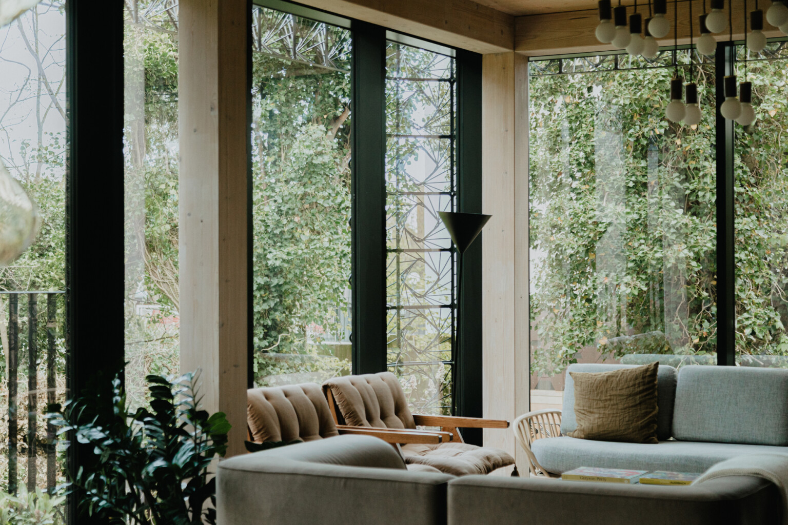
Do you have a favourite design feature/s?
The kitchen is a beautiful space that is absolutely central to the experience of the house. When you stand in the kitchen you have the luxury of a beautiful modern and functional space combined with the adjacent glass wall through which you see the clematis weaving up the lattice of the facade, with trees and grass as a backdrop. That contrast and comfort is incredibly unique to me and it's a very satisfying place to be and to live.
What was your biggest challenge/s?
The biggest challenge for us was the fact that so much of what we built was new, both to us but also to the contractors, partners and wider community, and that created obstacles for us in every way. We built the house during the pandemic, which added huge challenge. After all is said and done, we believe in new ideas, and despite the challenge we have something unique and in my view conceptually new in architectural design, which is a positive outcome for sure.
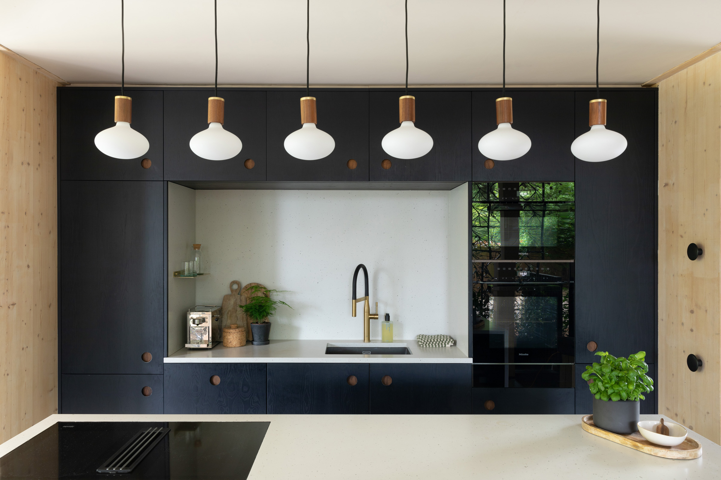
Was there anything that surprised you about Miele appliances?
From the start of the collaboration with Miele we were simply surprised by the level of design quality we found throughout all the appliances. We'd not experienced Miele before and going to the Experience Centre to see the products was like no other experience we'd had in terms of product or brand introductions. The features, the functionality, the aesthetics, simply better than anything we'd ever used or owned. I think the reason why I say it was a surprise, is that so many brands and products are designed to tick the boxes and get bought but when we were introduced to Miele we realised that every possible additional contribution that can be offered through fantastic design, is there. The design aspiration shows through so clearly, which is refreshing.
Did you have a favourite Miele appliance?
I'm so satisfied by the aesthetic combination of the ovens and induction hobs (so rarely something you're happy to show off visually in a space) but in my household I am responsible for the cleaning more than the cooking, so I have to say the washing machine and dryer are my true favourites. They make washing huge loads so satisfying and easy, and I sincerely love using them.
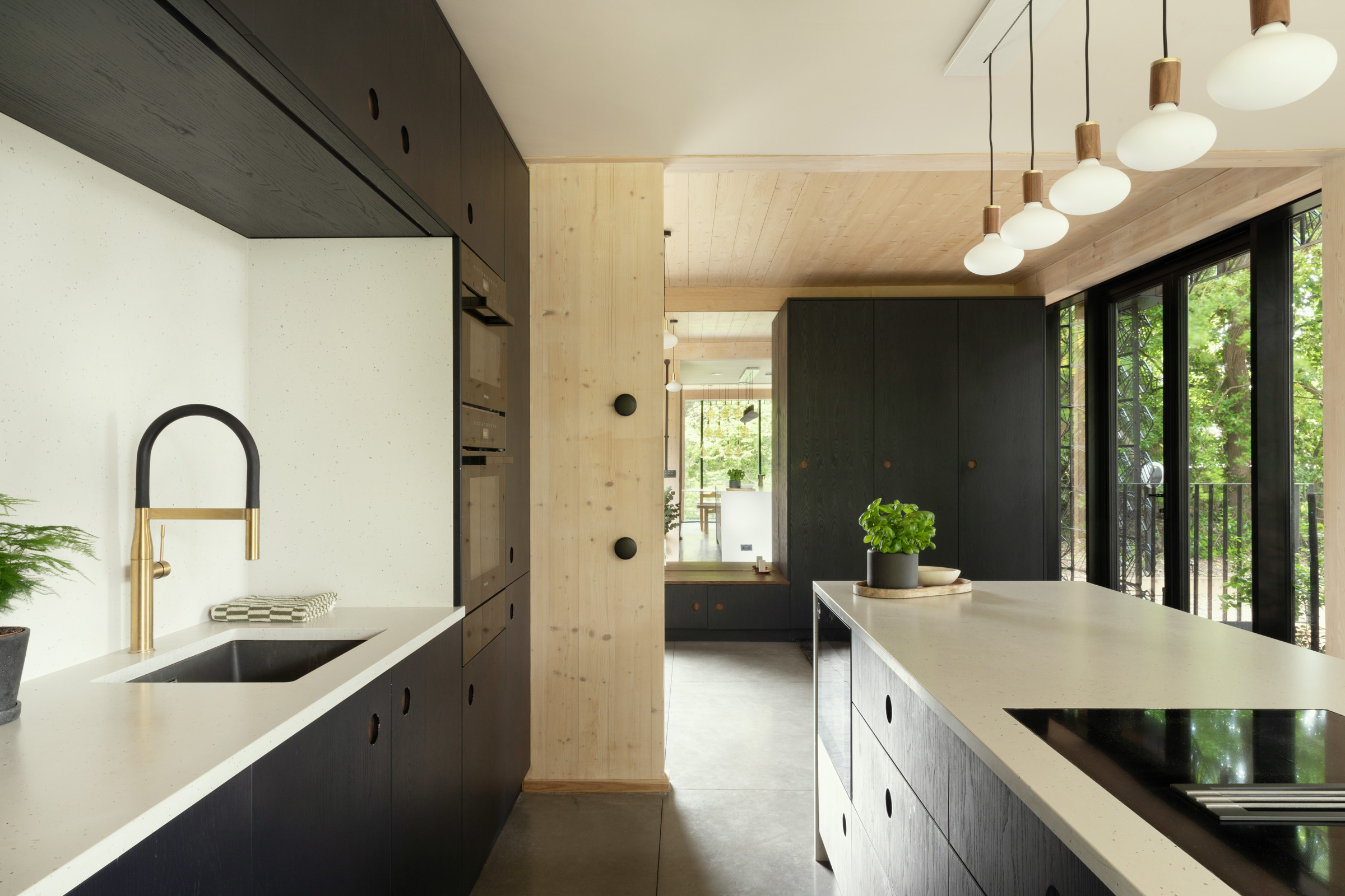
What advice would you offer to our readers who are currently planning a home/ kitchen renovation?
I think considering the flow of the space is key - our space is very open and because of the island (which houses the induction hob and the wine conditioning unit) it's a nucleus for the house in terms of gatherings and spending time. The flow through the space enables that, so I would say consider the context of the kitchen and appliances to enable them to work with the rest of the house.
Photography: Rachel Ferriman

Planning Your Kitchen?
Discover the precision and accuracy of Miele with a complimentary 5 course taster menu that brings the appliances to life.

