We are delighted to be able to share with you this inspiring kitchen and talk to Eve Turner of Neil Lerner Kitchen Designs who discusses the design evolution of this contemporary, open plan kitchen that is regularly used to entertain in.
How did you begin the project? What was your brief?
“We started very early in the project as the client was undergoing a major refurbishment of their family home, which included moving the kitchen to the opposite side of the house. The new layout is open plan and contemporary in style compared to the previous traditional wood kitchen. The client entertains frequently and required ample storage and worktop, along with appliances that offered capacity and flexibility for their cooking needs.
The design brief was: elegant and minimalist with a feature island.

How does the layout work?
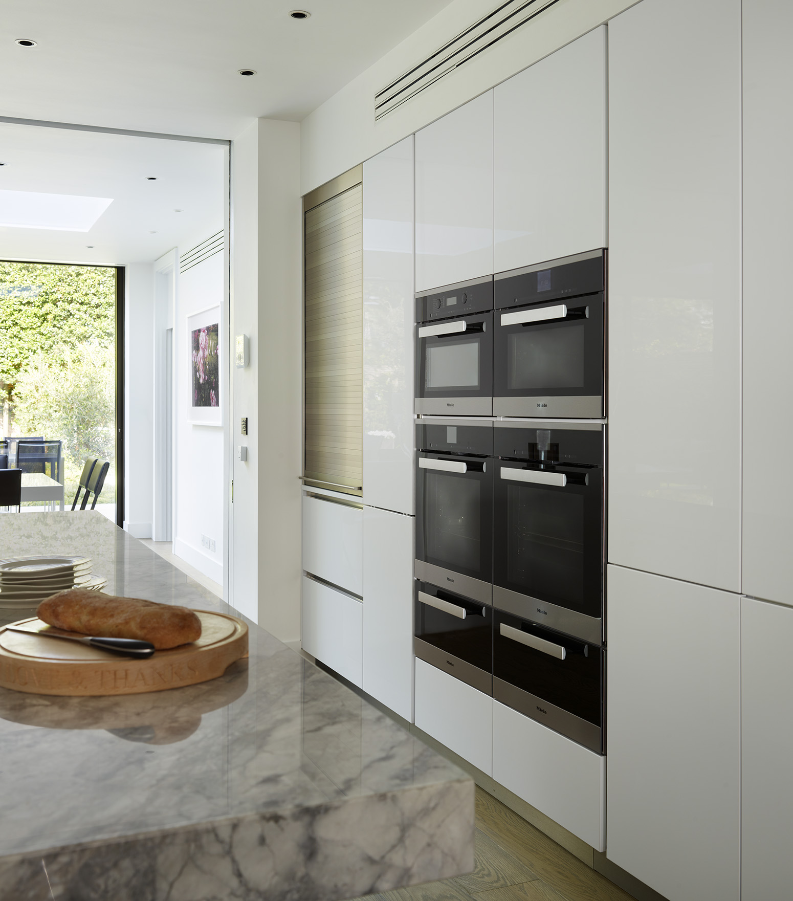
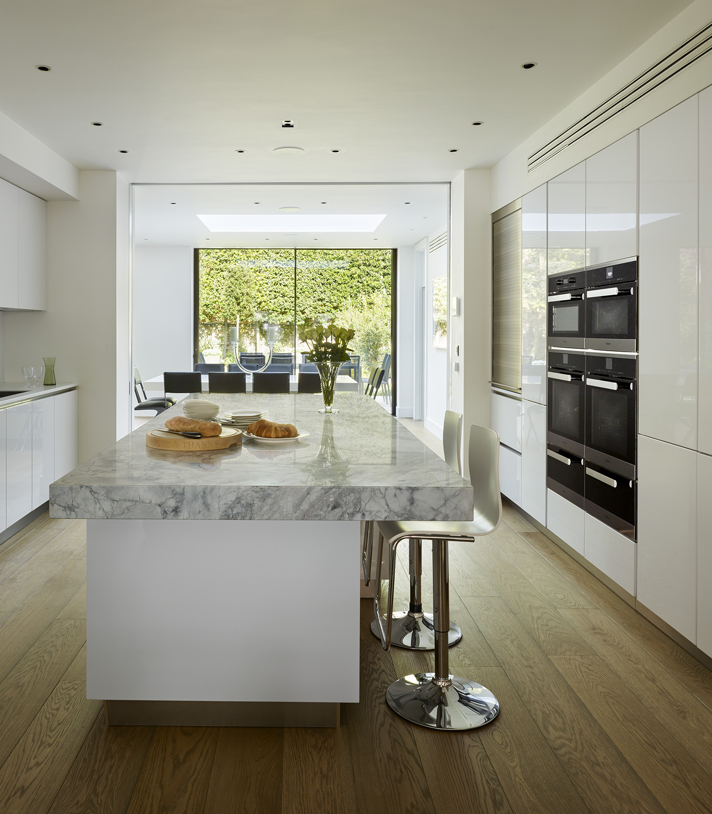
The long bank of tall units house the cooking and cooling appliances and creates vast storage for dry foods, crockery, cutlery and small freestanding appliances, which can be hidden by the roller shutter. With the island directly behind, there is ample worktop space to set down dishes from the ovens, as well as giving the additional option for people to work on both sides of the kitchen. The island also offers seating within the kitchen. The client didn’t want the sink and hob on view as the kitchen sits between the dining and living area, so we placed the hob and sinks along the wall opposite to the tall units, allowing the central island to offer the majority of preparation space.
There is a real harmony between the indoors and outside – how did you achieve this?
The kitchen forms part of a large open plan design all on one level that connects into the dining/living space. With large glass sliding doors to the rear onto a landscaped garden and a window at the front of the property, light flows throughout the space. We tried not to over complicate the design so that all of the areas became one continuous space running into the garden.

Tell us about the impressive island – how does it fit in? Is there a reason that the hob was not chosen to be incorporated into it?
The island is primarily designed for preparation and seating with the addition of extra storage. With hobs and sinks normally becoming messy in a well-used kitchen, we wanted to hide these on the side wall and not distract from the beautiful stone. We chose Blanco Perfecto quartzite stone for the worktop, which has dramatic markings and built the stone up to 100mm with a down stand to the floor framing the island to create a feature piece.
It is clear that your clients love to cook and entertain, can you tell us more about the appliances, the choice of layout, their design etc?
With such a large investment in the kitchen and the appliances, we recommended the client visited the Miele London Experience Centre to test out the appliances to be confident that we had selected the models that suited their requirements. The client needed two ovens and a simple microwave; she was also tempted by the combination steam oven and it was definitely her visit to Miele that made her decide to go ahead! The ovens sit in a bank of four with deep warming drawers below to create a symmetrical and functional setting.
The induction hob sits neatly in the Corian work surface and uses the Con@ctivity 2.0 feature with the Miele slimline telescopic extractor. The cooking area is very discreet but functional.”

