Industrial design is a key interiors trend for 2018 and has been growing in popularity as an alternative to a traditional Shaker style kitchen. This kitchen was designed by Daniele Brutto of Hub Kitchens for a couple who had recently extended the ground floor of their home. The clients wanted a kitchen that reflected the exposed architectural features, with a dark industrial theme. We spoke with Daniele to discuss how this look was achieved, as well as his advice for readers coveting a similar look.
How did the architectural features inspire the finished design?
The client had decided to expose the steel beams in the kitchen and use dark framing on the glass elements, so they were keen for the kitchen itself and the materials chosen to reflect this distinct architectural look. The intention was to create a functional space that had an edgy finish, using the latest materials and textures on offer.
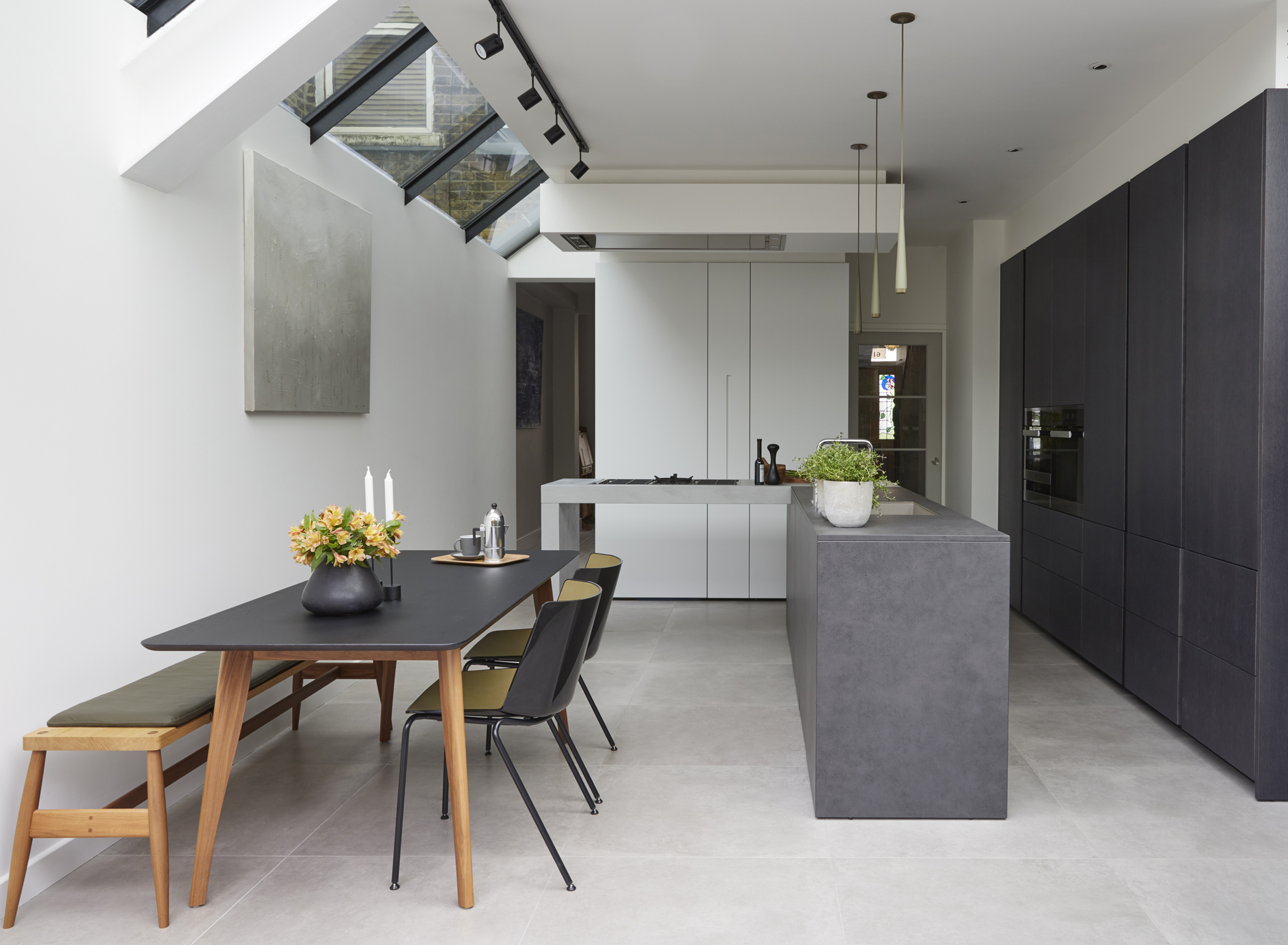 Photo Credit: Jake Fitzjones
How long did the initial process take from planning to completion?
As to be expected, the design and planning phase took longer than the actual build – for us, the initial stages are the most important part of any project. The client first entered our showroom 18 months before the kitchen was completed, with the build taking just six months.
The island has a very distinctive design – how did this come about?
The floating island was designed to be a real stand-out feature, reflecting the architectural feel of the space. Suspending the worktop in this way with no base units below also helps this part of the kitchen to be less cluttered, giving it a sleek feel and helping to balance the heavy grey tones. All our furniture is prefabricated in Italy, so a lot of time is taken in the planning and designing of features like this so the fitting of it is actually relatively straight forward.
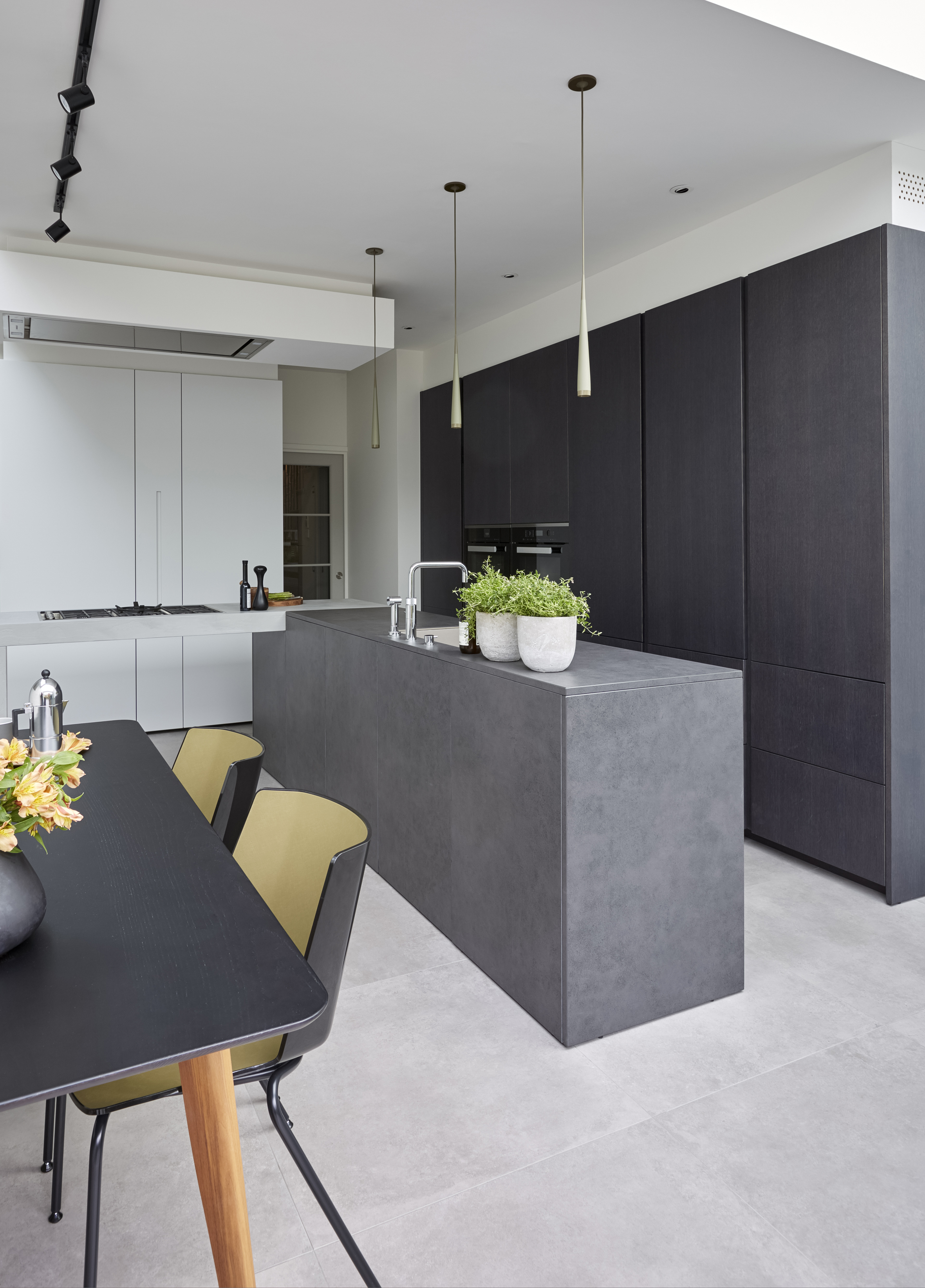 Photo Credit: Jake Fitzjones
How are practical elements incorporated in to such a sleek and minimal space?
A lot of it came down to the careful selection of appliances. The clients had previously had a Miele washing machine and so did not hesitate to specify Miele throughout the new kitchen design. A fully integrated Knock2Open XXL Miele dishwasher was chosen, keeping the sleek lines of the kitchen whilst being large enough to take plenty of big pots and pans in one wash. We also used a fully integrated Miele larder fridge to give the client that extra capacity without interrupting the design, as well as a separate fully integrated low-level freezer. The client loved the look of the PureLine oven range, with its predominantly black glass features and steel trims sitting well with the industrial feel of the space. Sitting the ovens side by side gives ample cooking space in a compact set up which doesn’t compromise on style. The addition of a Miele warming drawer under the steam combination oven enhances the look of the oven set up, as well as offering the extra convenience and cooking capability offered by the appliance.
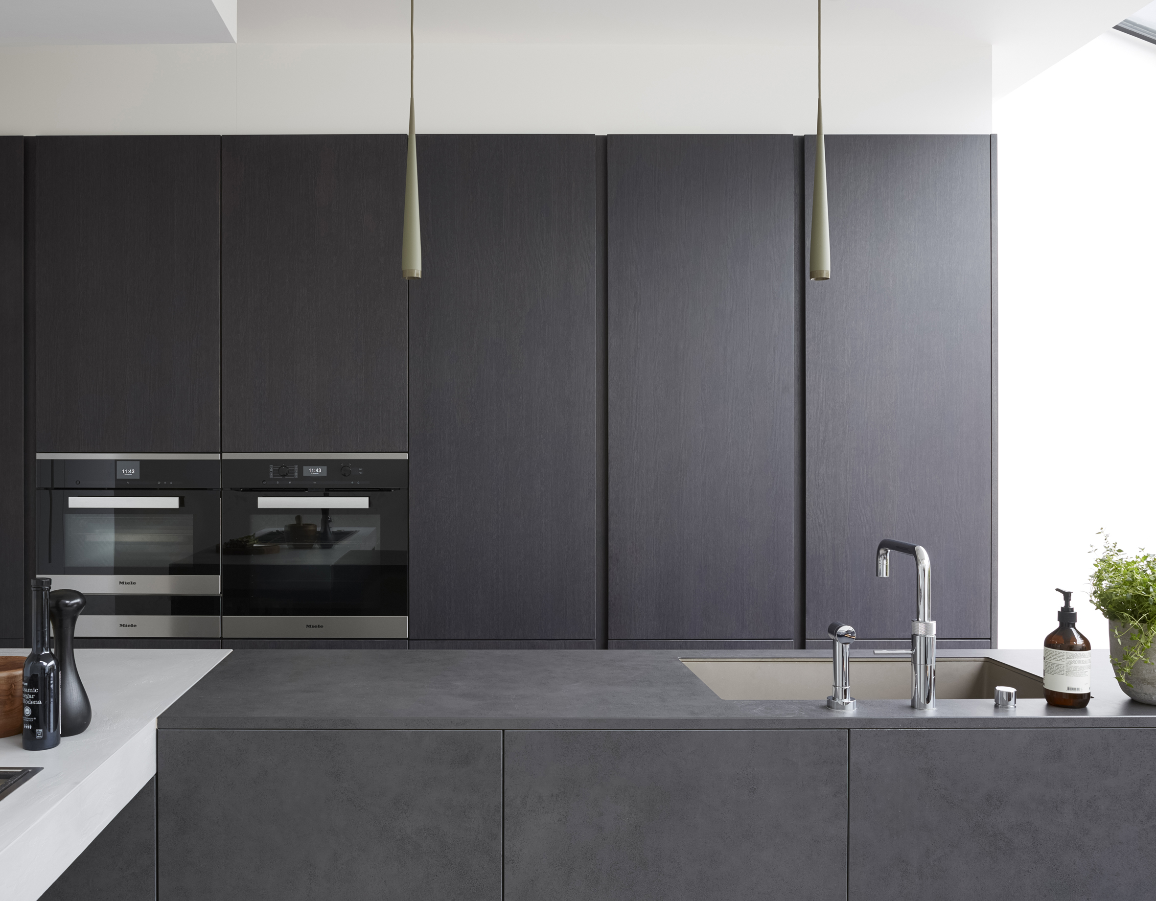 Photo Credit: Jake Fitzjones
How did you decide on the colours and materials?
From the offset, we knew that the client wanted a dark industrial theme for the kitchen, with hard surfaces and edges offering texture and depth. The lighter texturised Ecomalta worktop contrasts perfectly with the harsher solid block Kerlite ceramic, balancing the tones in the space, whilst the dark grey veneer adds a little warmth. Stark white units were used for the laundry and coat area behind the island to act as a blank canvas and allow the suspended worktop to really pop.
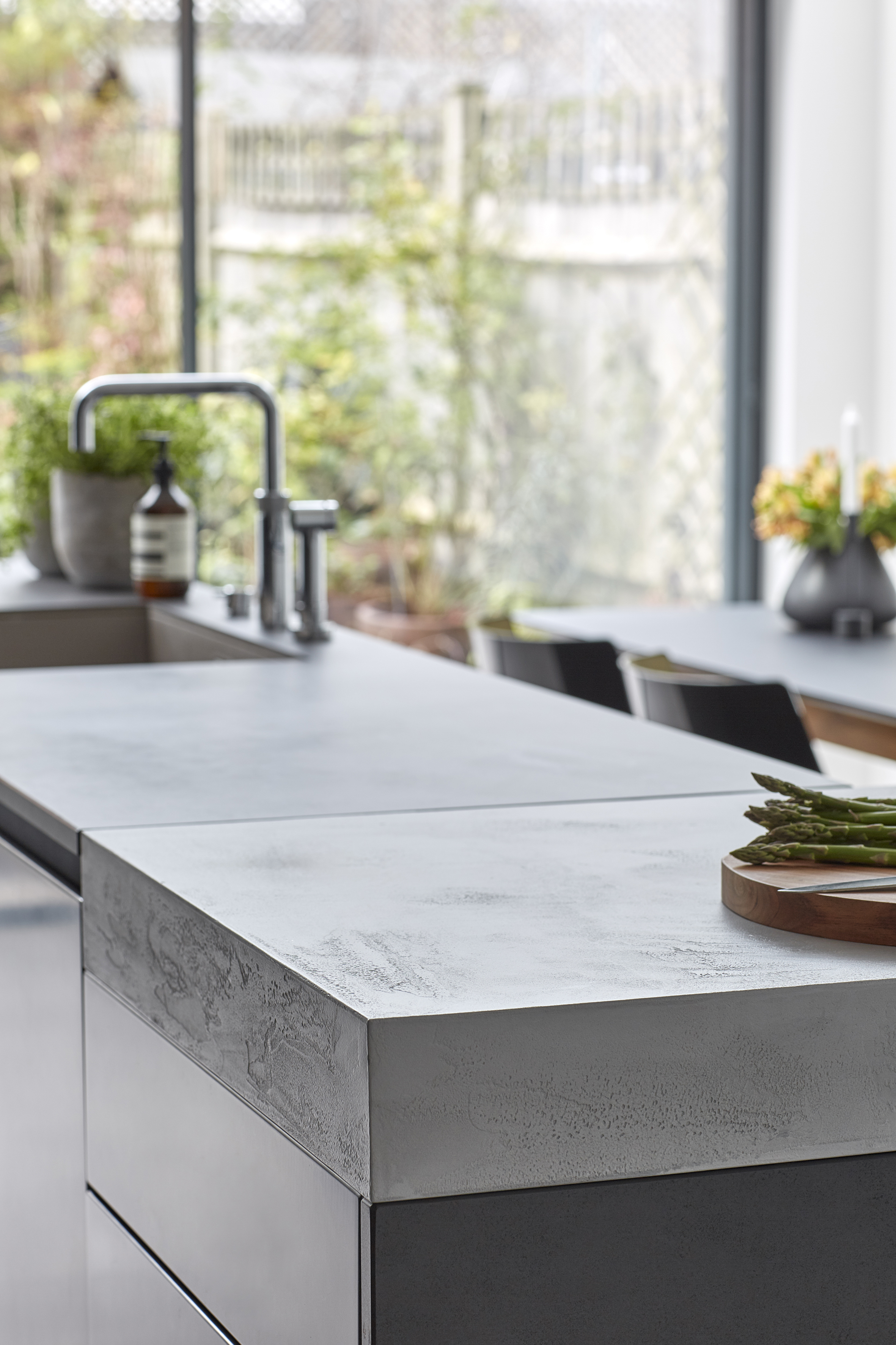 Photo Credit: Jake Fitzjones
What advice would you offer readers who are at the start of a kitchen journey?
The key to achieving a great kitchen is to fully understand your lifestyle and how you want to use your space, and to communicate this to your designer. Considering the investment that goes into the creation of a new living space, most clients will only do this once or twice in a lifetime, so getting it right is paramount. I would advise readers to consider how their lifestyle might change and why they are creating this space, as having a focus on a clear brief always helps to make the right decisions on layouts, material choices and products. For this project, if something did not help or enhance this brief it was dismissed, and the result is a space that the clients love!
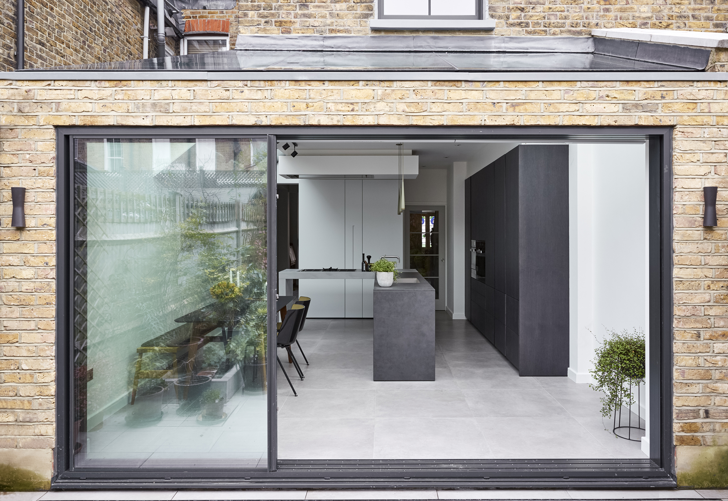 Photo Credit: Jake Fitzjones

Planning Your Kitchen?
Discover the precision and accuracy of Miele with a complimentary 5 course taster menu that brings the appliances to life.

