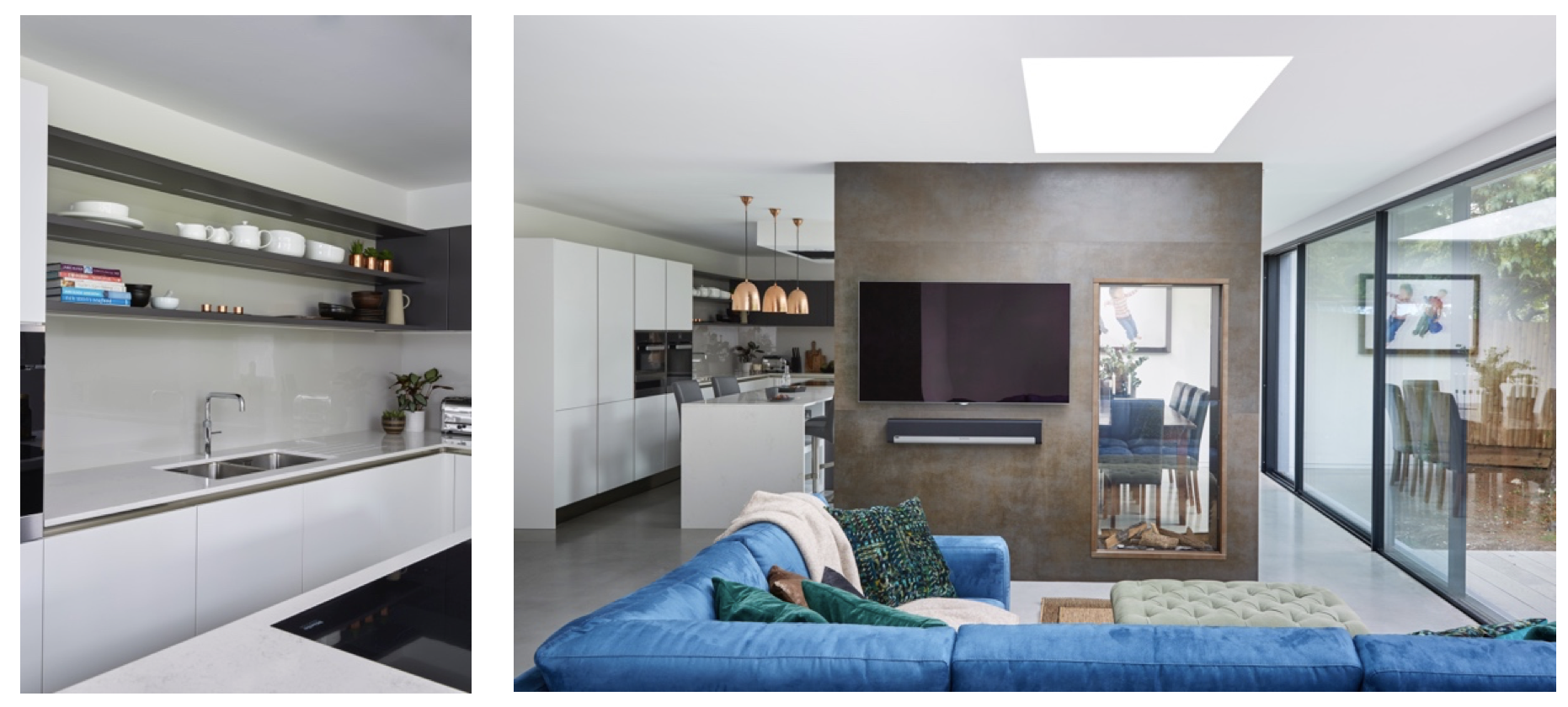
Open plan spaces began as a remedy to small, awkward period house designs, whereby kitchens tended to be small and rooms did not flow well for modern living. These days, whilst open plan continues to be a popular choice to combine kitchen, living and dining spaces, the emphasis is now on creating functional zones within these rooms to clearly define areas and their usage, recreating a sense of cosiness. We spoke to designer and co-founder, Daniele Brutto of Hub Kitchens about a recently finished project that incorporated this ethos – a large open plan space that balances both striking aesthetics and a fantastic experience.
What was the brief for this project?
The brief was to create a kitchen that could stand intense use, as the client enjoys cooking every day and often entertains family and friends, whilst looking beautiful within the client’s open plan setting. The extension was a new addition to the family’s four-bedroomed house, and we were briefed when the space was still very much in the process of being built, which provided the opportunity to start from scratch and design something that reflected the build’s contemporary look.

Why were these particular colours and textures used?
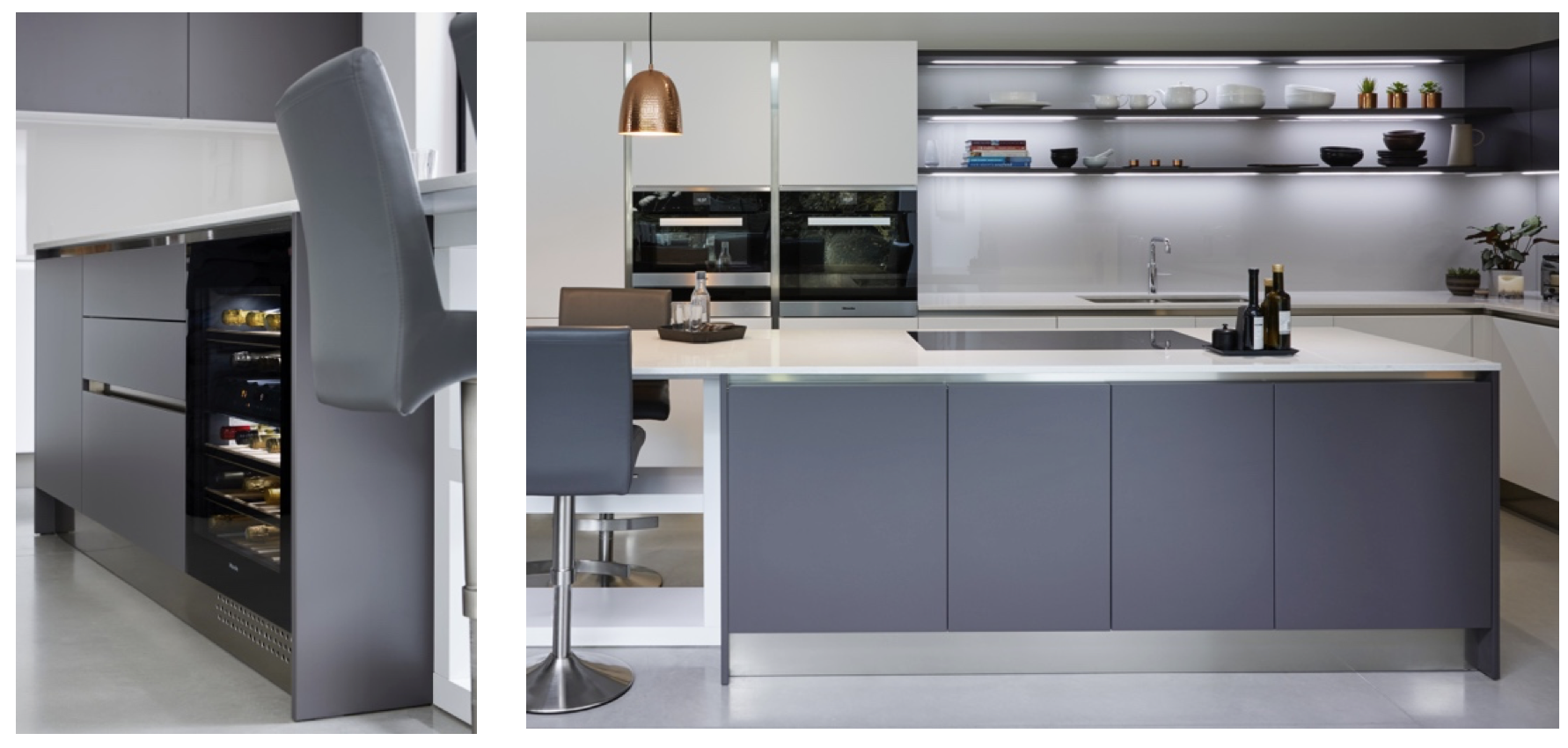
The cabinetry is from our Italian kitchen supplier, Record e Cucine. We chose the versatile Ainoa range of units, which can be specified in matt lacquers of any RAL shades. We selected a colour called Bianco Ghiaccio for the white units, a blank canvas that allows other elements in the design to shine, like the bank of Miele ovens and the shelving units. To complement these, Grigio Ghisa, a dark grey matt lacquer, was used to give the remaining units real presence. The same colour was used for the open shelving and wall cabinetry for a cohesive look. The glass splashback helps reflect light in the darker part of the kitchen with a very subtle beige colour. This combined with the chimney breast’s porcelain cladding helps to bridge the gap between the stark white and grey units, adding warmth and grounding the whole design.

Why were Miele appliances chosen?
The client came to us via a recommendation and after her friend explained how well her Miele appliances performed in her own kitchen, the client knew it had to be Miele throughout. She loved the clean lines of the ovens, coupled with their functionality and big capacity, ideal for entertaining. The push to open wine conditioning unit was also a favourite, and the quietness of the dishwasher was paramount in such a large open plan living space. We then also fitted Miele washing machines and tumble dryers for the utility room which work great.
How does lighting help to zone the kitchen areas?
We zoned the lighting in the kitchen with under cabinet LED strip lighting in cool white, perfect for task lighting to aid cooking and food preparation, especially in this darker part of the kitchen. We then recommended warm white copper pendant lights to help differentiate the island’s breakfast bar area, with sharp LED down lights for over the hob and working area.
The space incorporates two seating areas – is this becoming the norm for open plan designs?
Yes it is, but it is very important that the two areas are well defined and their use is slightly different. In this space, the breakfast bar, although quite large, is only used for morning coffees and social seating when entertaining. The family never sit at this breakfast bar for dinner as that’s what the larger table is for, which is more comfortable to sit at for longer periods and can seat more people. We would always recommend having two seating areas at different heights, which automatically defines the areas and gives them clear purposes in open plan kitchen-dining spaces such as this. The breakfast bar area is actually my favourite element of this kitchen – I think it’s a simple feature that works really well to fuse the two spaces together in one seamless piece of design.
What are the key considerations for open plan living?
Open plan spaces can often feel cold, so it’s important to consider colours and materials to inject a sense of warmth and depth. Zoning is important to give each area a sense of purpose, and this can be done with contrasting materials, colours or through elements such as lighting, as with this project where we have incorporated pendants to designate the eating area of the breakfast bar.
From an appliance perspective, quiet appliances are key to ensure that their use isn’t disruptive – nobody wants to hear the dishwasher in the background when they’re trying to relax after dinner! When cooking and entertaining in one space, it’s important to consider a ceiling mounted extractor fan with a powerful external motor. This will help to ensure that you will not be engulfed with steam or unwanted smells, allowing you to cook until your heart’s content without a noisy extractor motor disturbing you and your guests.
Finally, what advice would you give to other readers who are ordering a kitchen for a new space or extension that is not yet completed?
The client employed our services in the very early stages of their project planning phase and they knew straight away what key materials they were going to use, such as the polished concrete floor. This gave us the opportunity to design the kitchen to blend with its surrounding environment from the start, and I think this shows in the end results. Being able to work together with the client on every stage of the project was incredibly beneficial to creating a harmonious space – for example the pendant lights were chosen by the client and they worked so well as they were inspired by our original design renders which showed copper as a complementary material for the scheme. If clients could commit to all their suppliers at this early stage then I think this is the best piece of advice I would give to anyone looking to embark on a project of this size.

Planning Your Kitchen?
Discover the precision and accuracy of Miele with a complimentary 5 course taster menu that brings the appliances to life.


