Sophie Paterson is a renowned interior designer and businesswoman with an impressive social following. Known for her timeless, classic styling, we sat down with Sophie to discover her top tips for styling your home. Read on to find out where to start with a redecorating project.
What is the secret to great interior design?
Lots of planning and double checking! 95% of what we do is behind the scenes, arranging and managing sub contractors to ensure we achieve the faultless attention to detail and seamless customer service our clients expect.
Where should you start with a new decoration scheme?
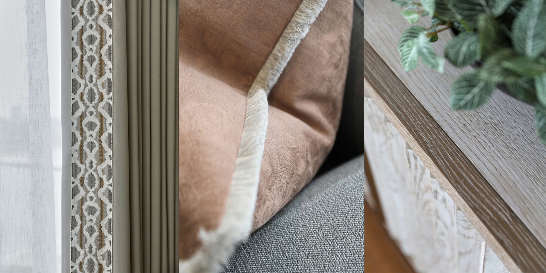
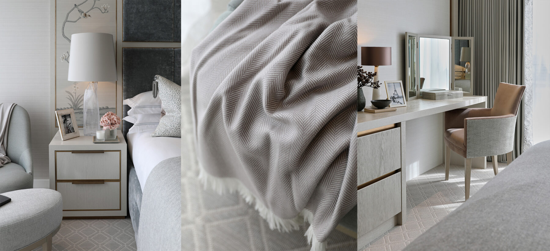
Work from the bottom up. I like to start with a floor plan to get the layout right. Next, move onto fabrics - the aim is to balance colour and texture around the room.

How do you make a house a home?
A home has to be comfortable and practical and not just a show house to look good in photos. Plenty of storage and practical finishes designed to last are key for our clients with families. Their homes should be easy to maintain and relaxing to live in.
How does open plan living impact on interior decisions?
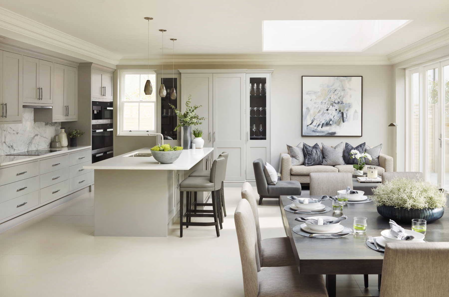
Open plan spaces can start to look very cluttered if you are not careful. This is where clever storage is key. It should be worked into the design from the beginning and not added as an after thought. You will also need to consider the space as a whole when it comes to the colour scheme. Zone areas by using rugs and furniture placement. Open plan areas lend themselves to pared back design, with less decorative items on display. This ensures it feels harmonious and not too busy.

What is your top piece of advice for a coherent open plan living/ dining space?
I like using statement lighting above the dining table and a console behind the sofa to separate the two spaces. Open plan living is great but it has to feel functional with clearly defined areas to make the most of the space.
Has the rise in multi-generational living had an impact on interior design?
Yes and no. Good interior design should be tailored to the clients’ needs and tastes, and multi generational homes are no different. It’s key to consider different requirements in terms of access, down to finer details such as seating height and placement of plug sockets.
Where do you find your inspiration?
Everywhere - I can’t switch my design brain off! Whether I’m travelling, shopping or dining out, I am constantly picking up little ideas to work into our projects. And of course I love Instagram and Pinterest for the ability to admire design from around the world. There is no way you could see such a varied selection of products and design without the internet. It’s great for gathering inspiration.
Any tips for styling accessories?
Group them together - decorative accessories shouldn’t be placed in a line. I like to cluster them in little groups of varying heights. It is a good idea to coordinate the colour with the accent colour in the room to emphasise and add interest.

Do you opt for different lighting solutions around the home?
We work a lot with the team at John Cullen, who have so many great ideas when it comes to lighting. A lot of the properties we work on are Grade II listed buildings where you can’t install downlighters and so you really have to think outside the box. It’s key to incorporate a variety of settings for different tasks in each room. My top tip is to make sure the downlighters are round the perimeter of the room so they shine down the walls and above items you want to highlight. Avoid placing them where they will shine on top of your head! Put them on a dimmer and use directional spotlights for a further degree of flexibility incase you don’t get the position perfectly located or furniture is moved.
Should woodwork always match within a room?
No, we often use a mixture of different timbers. However, whilst they don’t have to match, they do need to be tonal.
What metallics do you prefer for a premium, luxe look?
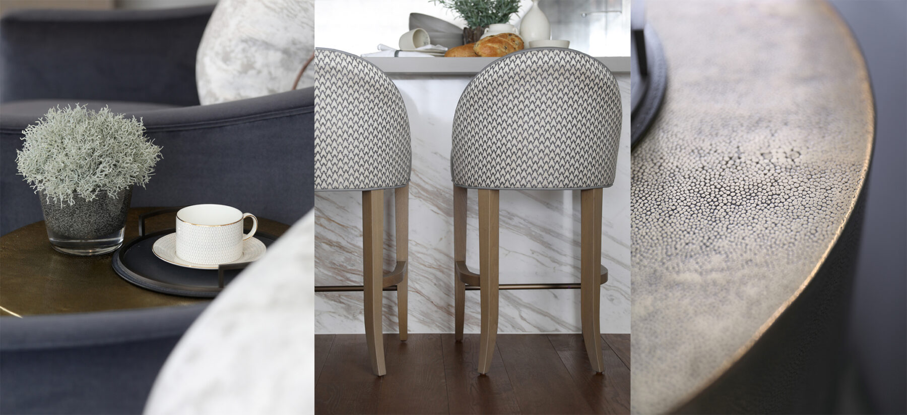
Bronze and antique brass are timeless and give a high-end look. We use these time and time again in our projects.
You are known for classic contemporary interiors, what are your top tips on how to achieve a timeless look?
Don’t be swayed by any “of the moment” trends or items, as this is a guaranteed way to make your home feel more dated, more quickly.

Do you have a key feature / design piece that you like to incorporate into your designs?
No, we take our cue from the space and location. There are common themes that run through our portfolio but each design is made bespoke to the specific needs and tastes of that client and the property.
What interior design mistakes do you most commonly see?
Poorly proportioned furniture and an unimaginative layout that doesn’t make the most of the space.
What interior trends do you expect to see in 2019?
Lots more crittal glass and decorative screens. I think bronze and antique brass finishes will continue to be a popular choice, as well as sisal/ abaca rugs. Interiors are becoming more understated and relaxed.
You have an impressive Instagram following. What’s your top tip for taking a perfect photo for the grid?
Think about how a photo will sit with the rest of your grid, don’t just upload it on the spur of the moment. I might hold back an image for a few days until it looks better on the grid. You want a curated feed where the colours coordinate and there is a distinctive feel. Not just more of the same that you see on everyone else’s feed.
If you could only give one piece of advice to readers looking to update their interiors, what would it be?
Trust your instincts and only buy what you love. No one else needs to live there!

Planning Your Kitchen?
Discover the precision and accuracy of Miele with a complimentary 5 course taster menu that brings the appliances to life.


